Don’t talk about Manifesto Fight Club

Yes, this really was the heading to my notes today from Research & Bibliography. As an exercise in passionate thinking, our writing professor–DJ–fashioned a study of famous manifestos for us to read last week, and this week we were to return with a manifesto of our own in hand. At first glance, it seemed like the assignment was really an invitation and railpass for the crazy train, but I would say–without exception–people were fired up to present their manifestos today for the class. My topic was one of intense passion for me: fonts. What follows is a tirade on Comic Sans.
As we learned in our study, manifestos have a certain flair for formatting. Since WordPress can’t replicate that easily, feel free to view the original document here. Below is a little taste.
Because fonts matter. Fonts are the well from which you dip the written word.
Give me fonts drawn from a spring-fed pool ladled with a hollowed gourd;
Give me fonts brewed with coffee and served with cream in a ceramic mug;
Give me fonts distilled like smoky scotch poured in a cut-glass lowball.
These fonts enrich me.
Comics Sans is acid rain. Comic Sans is Sweet ‘n’ Low. Comics Sans is an appletini.
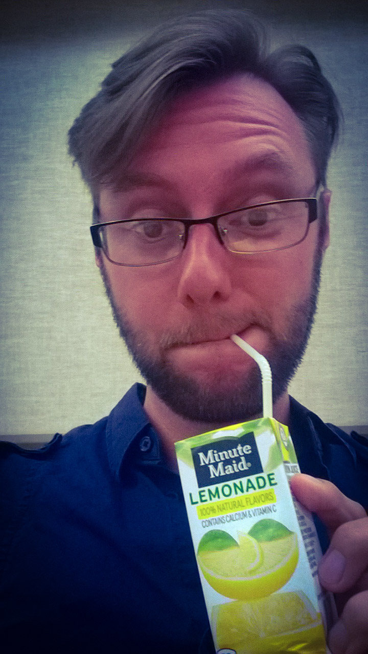
Snacks–and whose responsibility it is to bring them–occupies a full page in the syllabus for THEA 600. The first week, Shane started the trend of bringing juice boxes to accompany the munchies. I dutifully carried out the following with Jumex. Liv, thanks for the Minute Maid this week.

When I’m all business, it’s Times New Roman. When I want to have a let’s-be-friends, casual communique, my go-to is Comic Sans. Love it, love it, love it! How do you feel about Papyrus?
LikeLike
I like Papyrus, but I feel it is an accent or a title font. In the text body, it is tiring to read.
-bjb
LikeLike